You may have noticed it already: the two faces are gone.
What replaced them is one figure — still carrying the fire, still built around the same idea, just seen differently.
When DoubleCrazy started in 2024, we pictured the different sides of a person pulling against each other. Two years later, we realized neither side has to win. They can belong to the same person, at the same time.
That is what changed in the new DoubleCrazy logo. The D and C are built into the new mark, but the bigger idea is still the one we started with.
The short version: the DoubleCrazy logo represents more than one side of the same person. The old logo showed those sides in tension. The new one lets them exist as a whole.
Why Did DoubleCrazy Change Its Logo?
When DoubleCrazy started in 2024, the original logo made the idea behind the brand very literal: two faces turned away from each other, fire running through the middle, and a halo above one side.

Back then, we saw those two sides almost as opposites. Calm or impulsive. Rational or instinctive. Hold it in or let everything out.
That push and pull felt like DoubleCrazy at the time — expressive, restless, imaginative, and not too interested in sanding every edge down first.
Two years later, those sides still feel real. We just stopped thinking one of them had to win.
You can think something through and still follow instinct. You can keep it together and still have moments when you let go. One side does not make the other any less real.
That is why the two faces became one.
If you want to learn more about the story behind DoubleCrazy, visit our About DoubleCrazy page.

What Does the New DoubleCrazy Logo Mean?
The new DoubleCrazy logo brings that old push-and-pull into one character. Inside the team, the rounder shape picked up a nickname almost immediately: “Cookie Man.”
It stuck because the figure feels lighter and a little more playful. But lighter does not mean quieter. The fire is still there. So are the different sides: control and impulse, thought and instinct, restraint and release.
They just do not have to fight for space anymore.
ONE IDENTITY. MORE THAN ONE SIDE.
The D and C Are Hidden Inside the New Mark
There is another part of the new mark that is easy to miss at first: the D and C are built into the figure itself.

Look at the hand-side shape and you can read the D. Look lower, around the foot, and the C appears through the curve.


At first glance, the new mark says less.
But once you know what is inside it — the two sides, the fire, the D and C — it starts to say more.
We did not leave the old identity behind. We just found a different way to carry it forward.
What Stayed the Same: DoubleCrazy Streetwear DNA
A new logo does not mean a new personality.
DoubleCrazy is still about bold self-expression, strong graphics, and the freedom to move between different sides of yourself instead of fitting into one fixed box.
That is also why every collection does not need to look the same. Different series give us room to build different moods, ideas, and visual worlds.
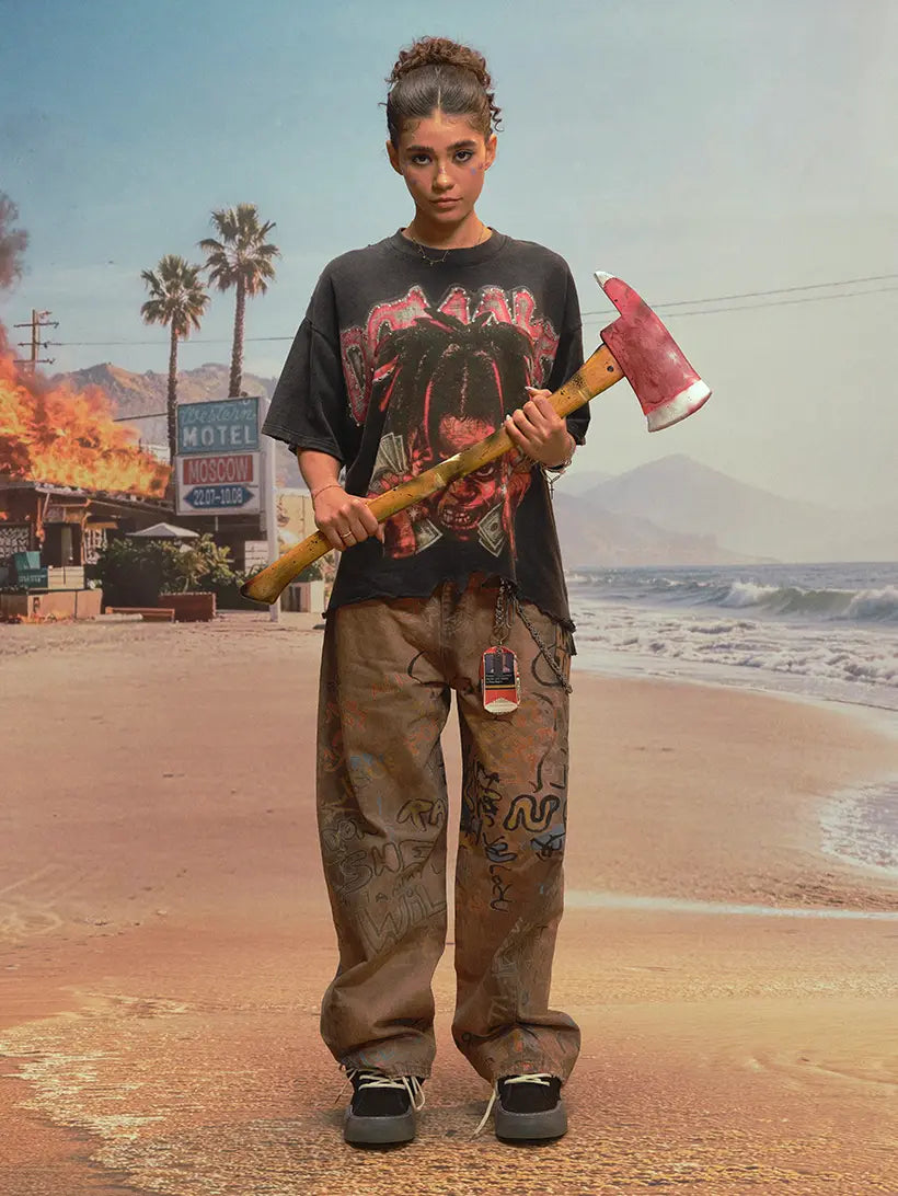
REBELLIOUS AND UNCONVENTIONAL, AFTERGLOW HORIZON, and CITY GONE CRAZY each show a different side of DoubleCrazy.
Different worlds. Same instinct.
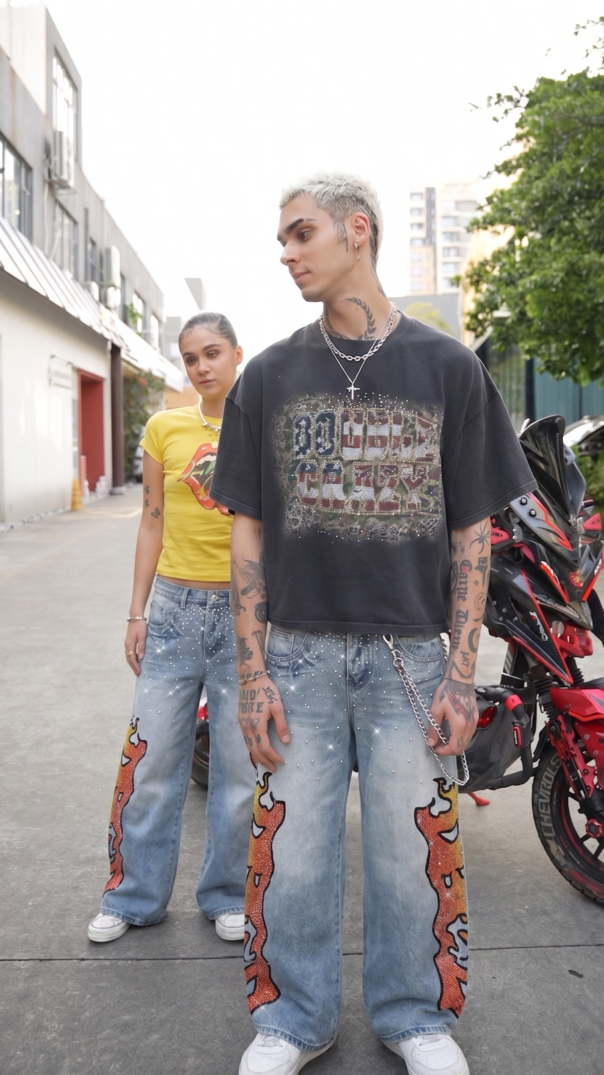
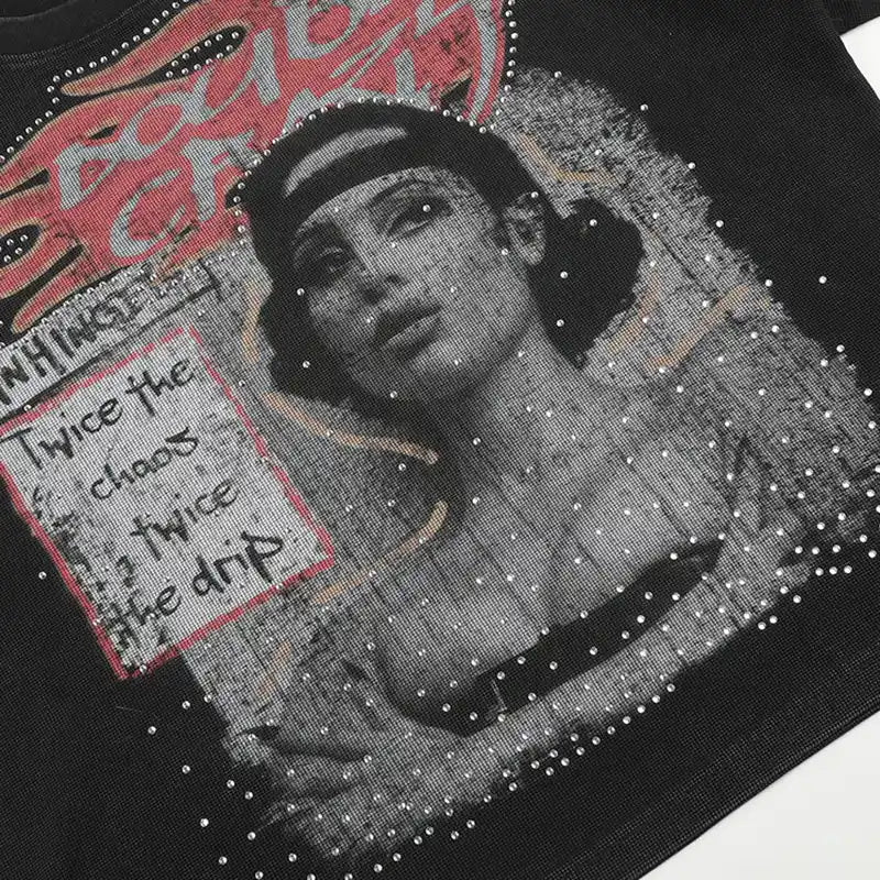
That expression does not always take the same form. In our unisex line, it can show up through oversized graphic tees and heavyweight streetwear hoodies, while other lines and collections move in their own silhouettes and visual direction.
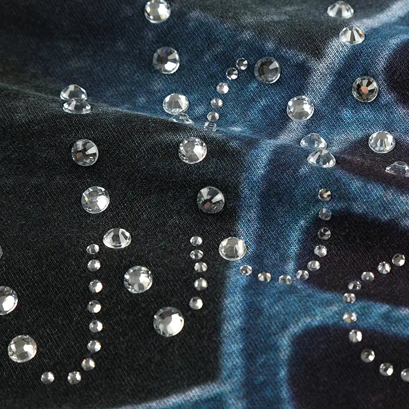
Washed and distressed finishes are another part of the mix across some DoubleCrazy pieces. If you want to look closer at that treatment, our guide to what heavy wash means in streetwear breaks down how faded texture can change the way a graphic tee or hoodie looks and styles.
The new mark may appear across clothing, packaging, tags, graphics, and campaign artwork as the new identity continues to roll out.
Does an Old DoubleCrazy Logo Mean the Product Is Fake?
No.
During the transition, products ordered through official DoubleCrazy channels may still arrive with the original logo on the garment, hangtag, packaging, or other materials. An older logo by itself does not mean the item is fake.
The safest place to shop is the official DoubleCrazy website. If you are unsure about a website, social account, email, or message claiming to represent DoubleCrazy, contact rationality@doublecrazy.com before ordering.
For general online shopping safety, the FTC’s online shopping guidance also recommends checking the seller, return terms, and payment method before buying from an unfamiliar site.
Where Can You Buy DoubleCrazy Pieces With the New Logo?
The easiest place to start is The New Mark collection.

That collection brings together the first pieces carrying the new DoubleCrazy logo across graphic tees, hoodies, long sleeves, and other statement pieces. As new drops arrive, more new-logo pieces will also appear in New Arrivals.
The story behind the mark matters to us. But eventually, a logo has to leave the screen and live on the clothes.
This is where the new identity starts becoming part of DoubleCrazy in real life.
Same DoubleCrazy energy. New mark.